
Horizontal format
Brand Use
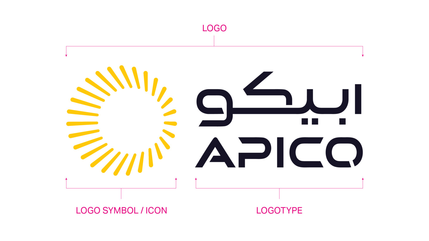
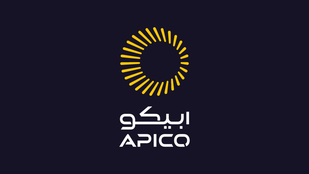
Our logo
This is our logo. The logo is made up of two key elements. The icon and the logotype. There are set formats for how these elements should appear together, as demonstrated below. Our logo is a representation of our brand and company.
DO NOT MODIFY IT UNDER ANY CIRCUMSTANCES.
Consistency in use will create value and trust in the brand and in turn the company.
Logo formats
The following are the logo formats are available for the APICO brand.
The logo is available in two different formats and four colour versions.
Where possible the primary logo should always be used.
Primary logo – Horizontal and vertical formats
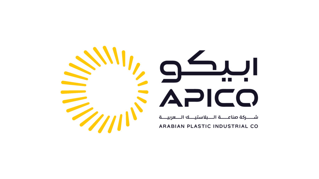
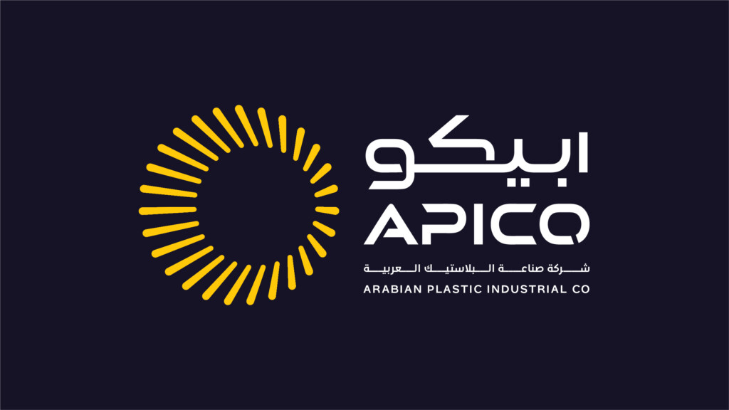
Secondary logo – Horizontal format with full brand name descriptor
The four colour versions available are:
Positive colour
Negative colour
Single colour
Single reverse colour
Logo’s should never be modified or distorted. Please follow the minimum size and clear space rules when useing the logo on any application.
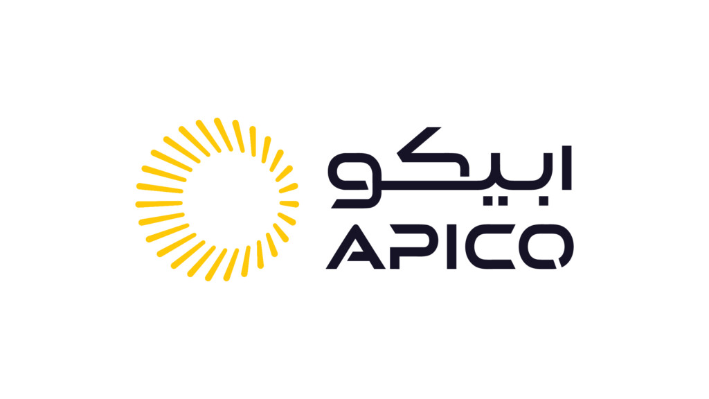
Horizontal format
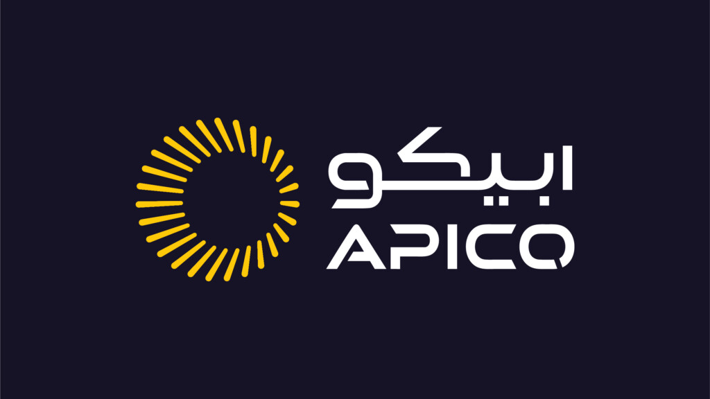
Horizontal lockup - full colour reverse
Vertical format
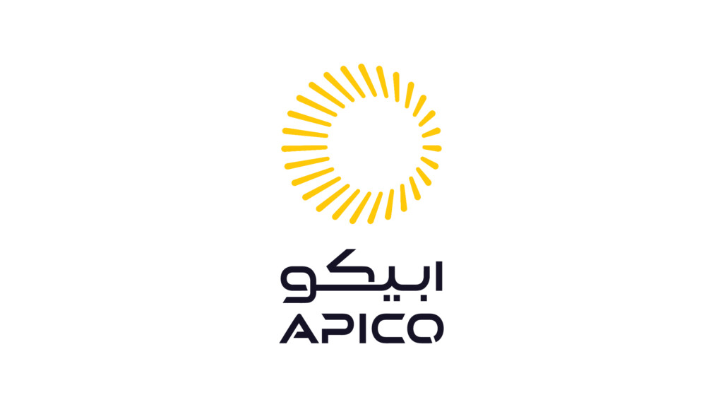
Vertical lockup
Vertical lockup - full colour reverse
Logo with descriptor
This version of the logo should only be used in exceptional circumstances for example when a legal requirement requires the use of the full organisation name.
Tertiary lockup - Legal use only
Tertiary lockup - full colour reverse
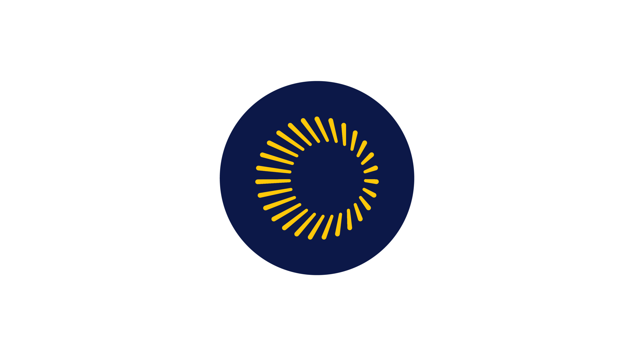
Icon only use
The logo icon can be used independently in applications such as social media profiles or websites where there are requirements such as a favicon. Also for reduced branding opportunities on merchandising.
Other than these applications listed, the logo should always appear as shown above, with the icon and word mark.
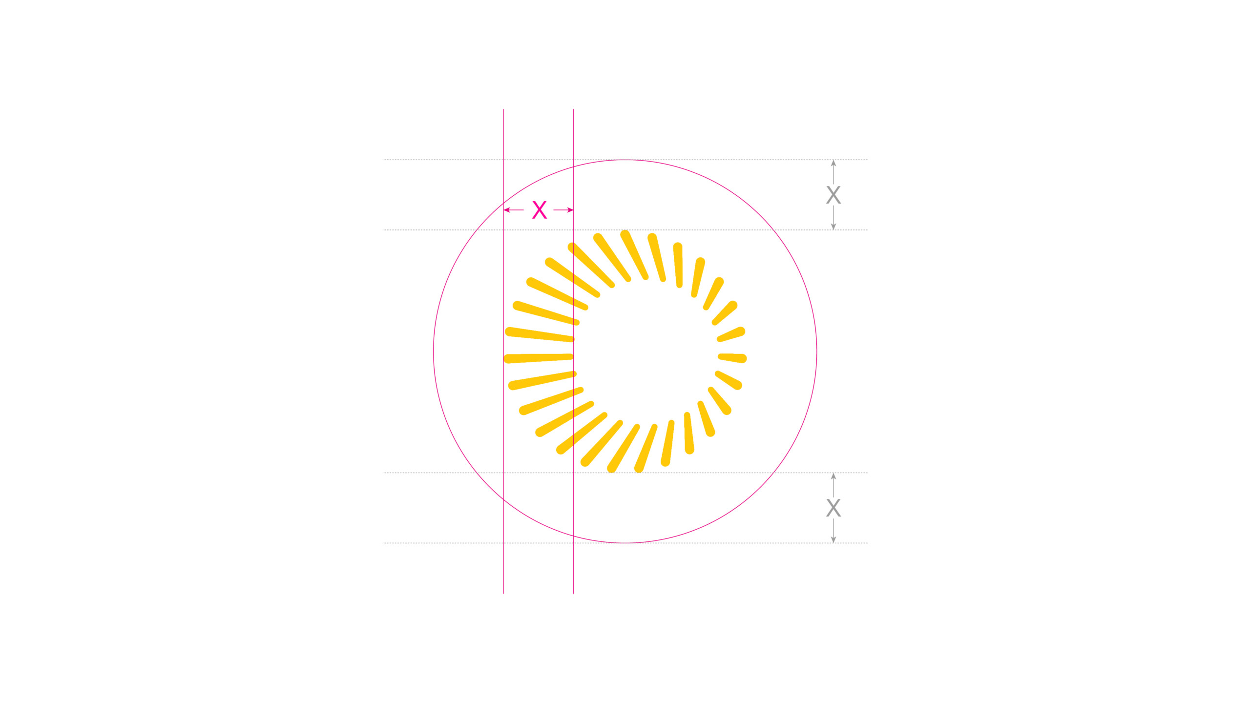
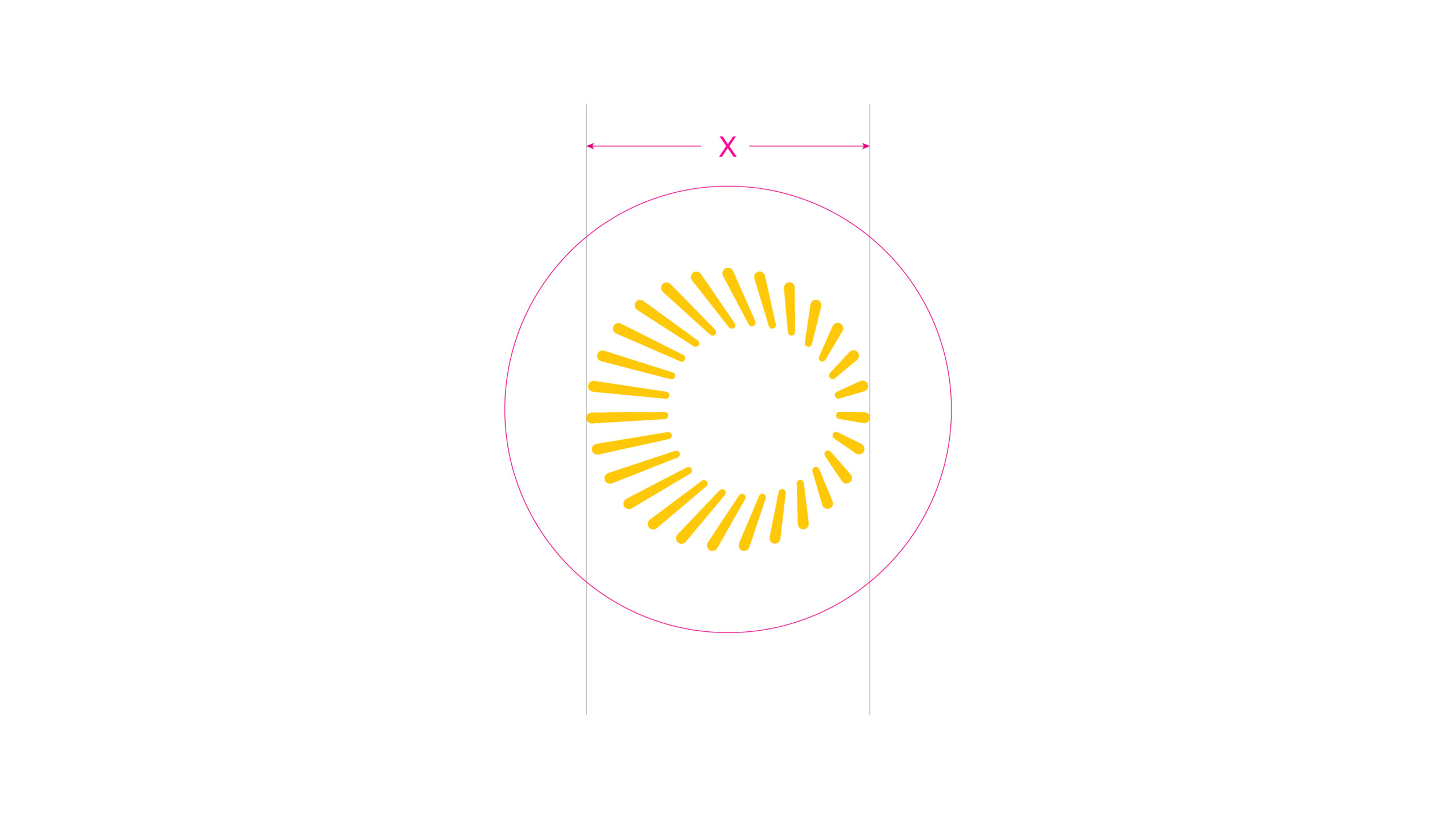
Clear space is for the icon is taken from the thickest point of the icon circle highlighted using X. Use this width – to create the minimum clear space around the icon.
Minimum width for the icon across digital applications is: 60 pixels wide.

Our name
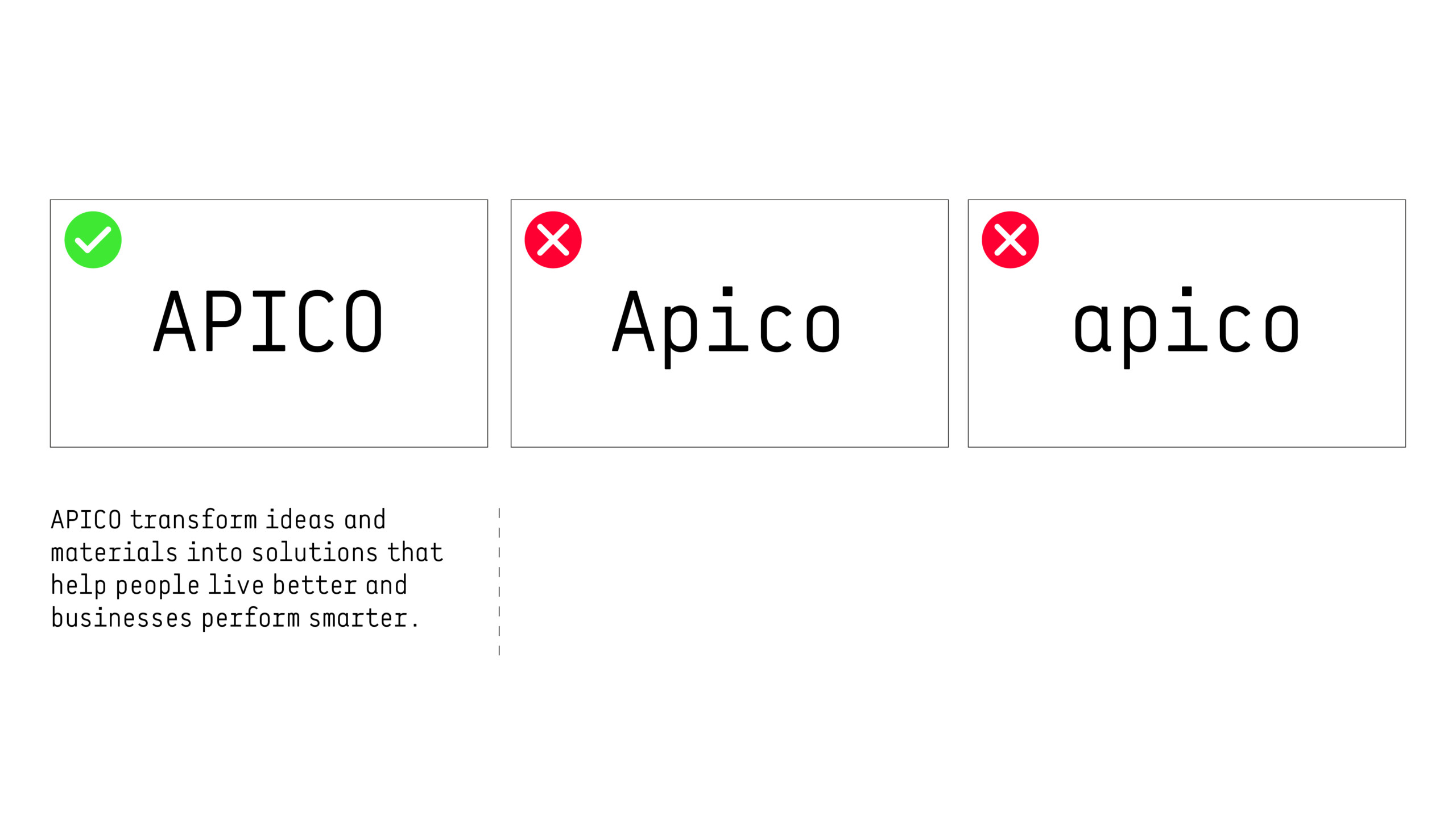
It is important to remember that even though the APICO logotype is in uppercase, it is essential to typeset APICO always in UPPERCASE across all body copy and headlines.
The following are examples of how APICO should be written within copy or set in applications.
Typography
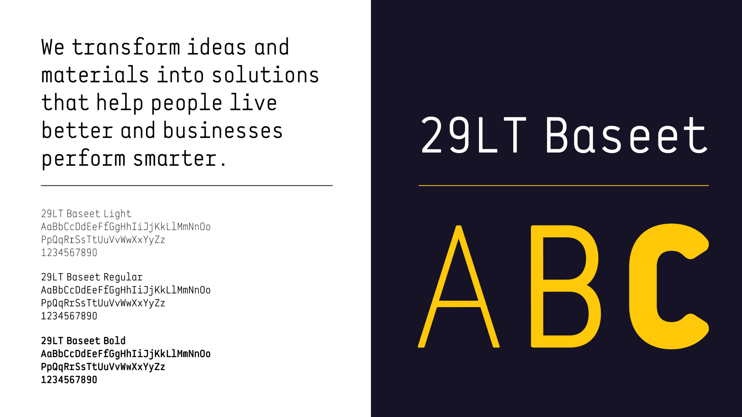
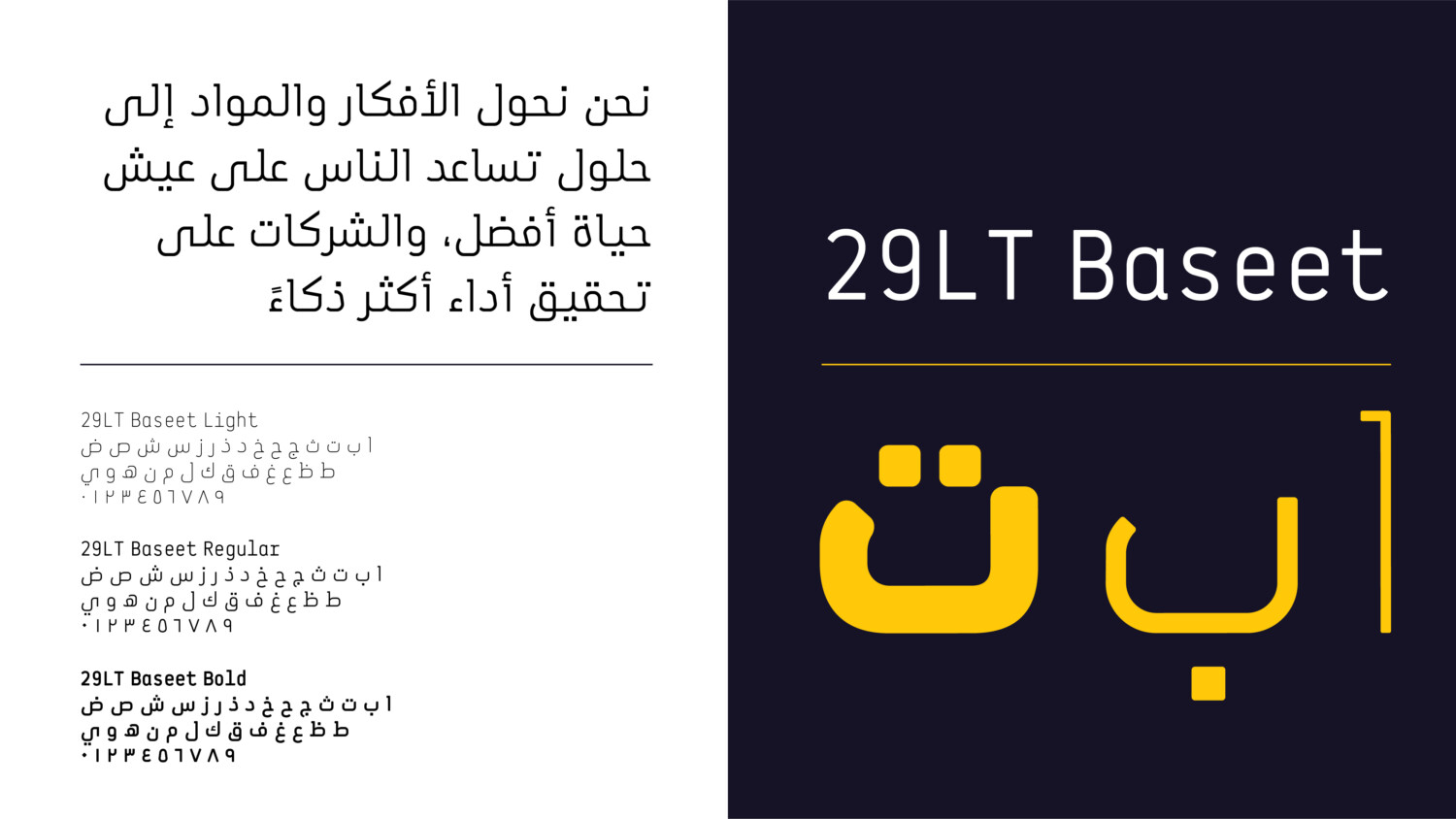
Typography should always be implemented in a clean and structured manner. Particular attention should be given to the weights used for body copy and headlines. 29LT Baseet is the brand font and is to be used for both Latin and Arabic languages. The typeface is available in multiple weights, allowing for the building of hierarchy across different types of information for example in information graphics or illustrating abstract or complex business concepts.
29LT Baseet Regular – Primary weight
29LT Baseet Light – For detailed information and significant amounts of body copy
29LT Baseet Bold – To highlight and draw attention to a selective amount of information
Colour Palette
The following is the brand colour palette for APICO and a guide to the ratio of colours that can be used across brand application. The ratios should be followed closely on each layout to maintain the personality of the brand.
The primary colour palette should always be used. Its consistent use will drive brand recognition.
The secondary colours are for highlighting or differentiating of information, such as presentations, information graphics, user interfaces for digital applications.
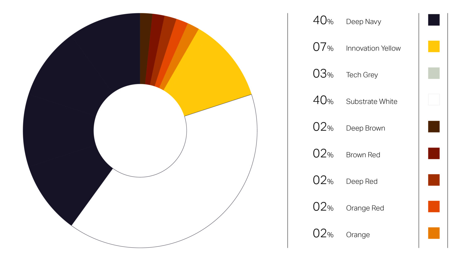
Primary Palette
Deep Navy
#161326
R 22. G 19. B 38
C 42. M 50. Y 0. K 85
Innovation Yellow
#ffc809
R 255. G 200. B 9
C 0. M 22. Y 96. K 0
Tech Grey
#bfc3c9
R 191. G 195. B 201
C 5. M 3. Y 0. K 21
Substrate White
#ffffff
R 255. G 255. B 255
C 0. M 0. Y 0. K 0
Supporting Palette
Deep Brown
#4b2201
R 75. G 34. B 1
C 0. M 55. Y 99. K 71
Brown Red
#7d1200
R 125. G 18. B 0
C 0. M 86. Y 100. K 51
Deep Red
#a12e01
R 161. G 46. B 1
C 0. M 71. Y 99. K 37
Orange Red
#e34702
R 227. G 71. B 2
C 0. M 69. Y 99. K 11
Orange
#e67a01
R 230. G 122. B 1
C 0. M 47. Y 100. K 10
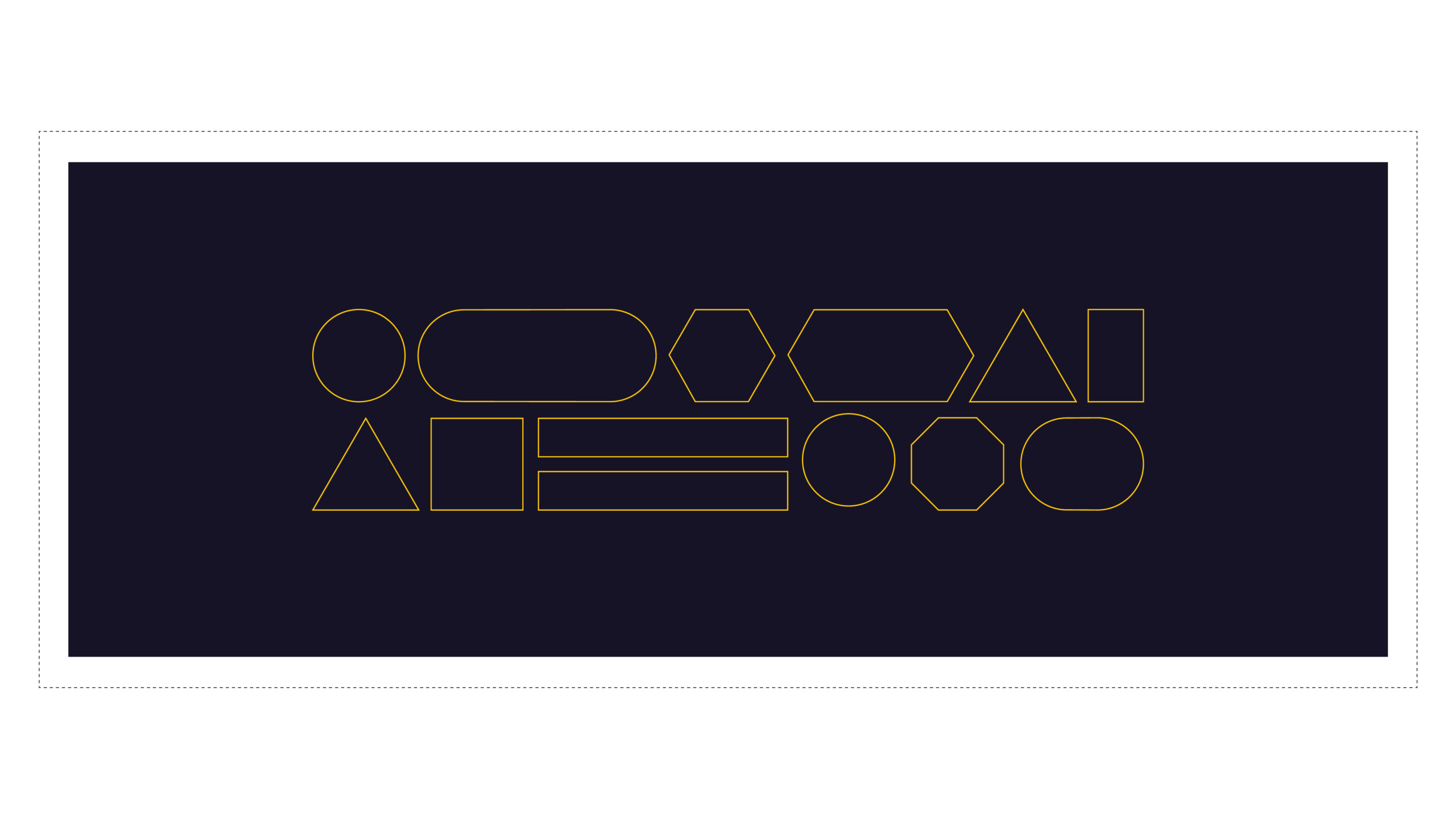
Graphic Language
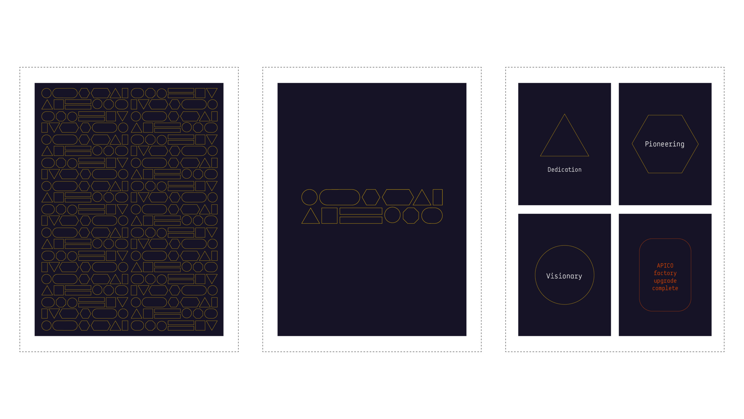
The following graphic shapes are the graphic components for the APICO brand. The shapes are abstract representations of the wide range of forms that can be made by APICO.
The graphic components can be implemented and utilised in a number of different ways.
The graphic shapes can be implemented in conjunction with or without typography.
Individual shape
Any of the shapes can be used individually as a singular shape component to highlight and draw attention to a specific piece of information in our brand and marketing touch points.
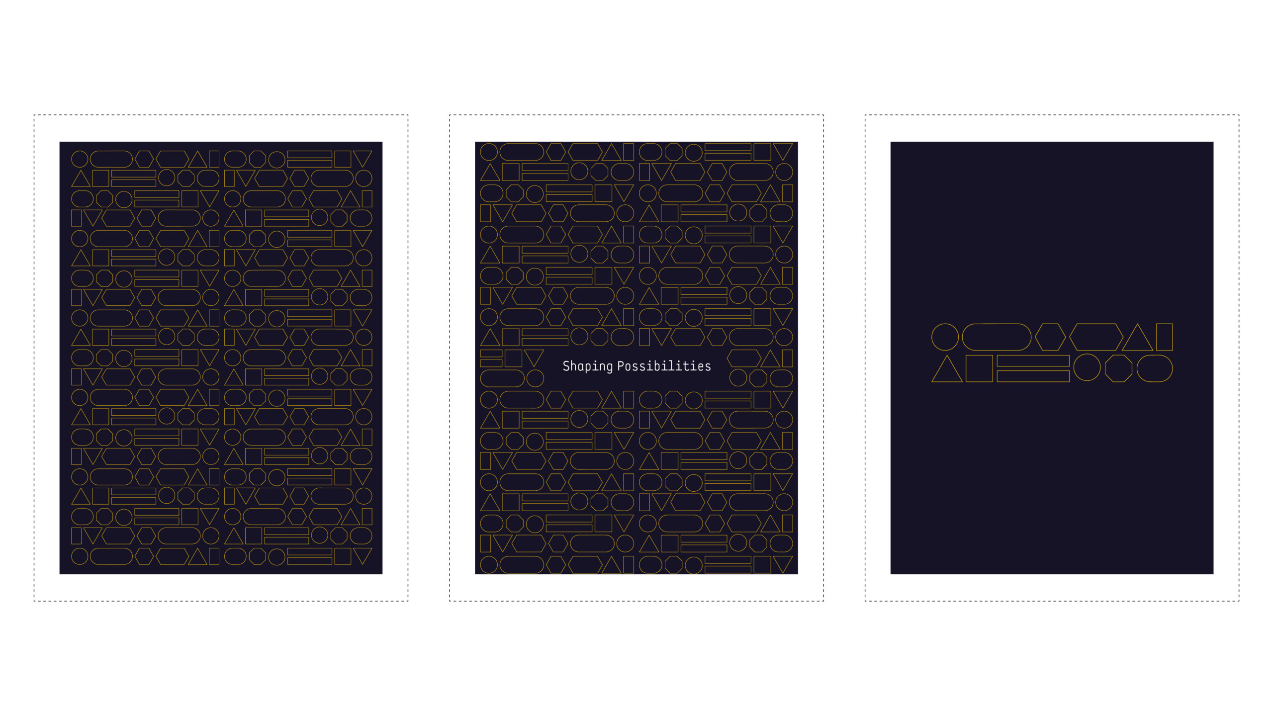
Small block pattern
This can be used strategically across different applications to create a recognisable component across any brand application – where something more subtle is required. For example a divider page/screen or as a visual accent.
Repeated pattern
This can additionally be used as a repeatable pattern where slightly more prominent visual stimulus is required such as in a backdrop at events or application in environments, or a more noticeable divider page / screen to signify a major content or section change.
Click here to download design files for the graphic components.
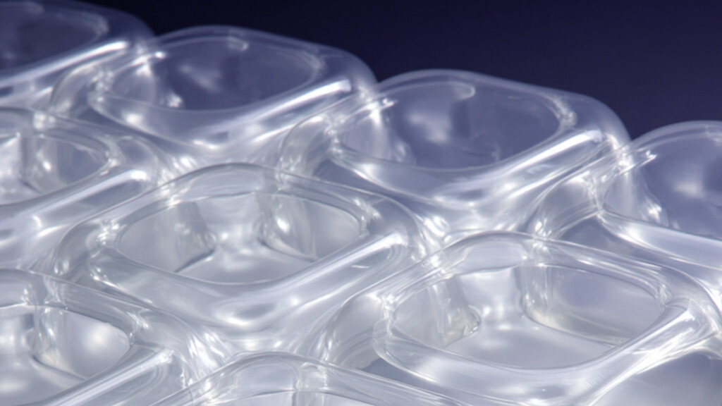
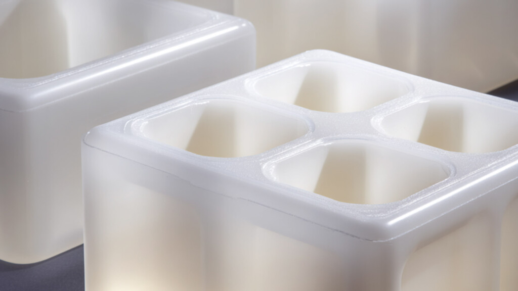
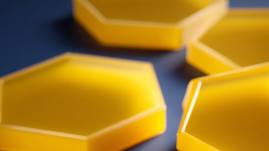
Brand Imagery
The APICO brand features a selection of abstract visuals of plastic moulds and formations. These are the representations of the what can be achieved in partnership with APICO and represent the idea of Shaping Possibilities.
Use these images as backgrounds to both real world and digital applications or to provide a visual stimulus in conjunction with engaging content or information about APICO products and services.
.
Overall across the entirety of the brand communications these should account for approximately 25% of the brand language expression.
Click here to download all brand images currently available.


